
Chase "More" Menu
I led the content design for Chase's first-ever "More" menu — a central hub where customers could easily access both essential banking features and value-added services. After launch, I drove iterative improvements through research and A/B experimentation.


Background
Problem Problem
Before this project, secondary features lived in scattered entry points. Users struggled with where to find tools beyond core banking.
Solution Solution
Built a brand-new IA and content framework for a scalable menu. Ensured the experience worked for both must-have tasks and discovery-oriented features.
Approach Approach
Three-phase evolution: Built the first version with JTBD framework, ran A/B experiments to gather insights, then refined the IA based on real usage patterns.
Impact Impact
Created a living navigation system that balanced clarity, discoverability, and simplicity. Post-launch benchmarks confirmed improved findability across all features.
Iteration 1: Building the "More" Menu
The first launch solved the "nowhere-to-find-things" problem. Customers finally had a central hub for secondary features.
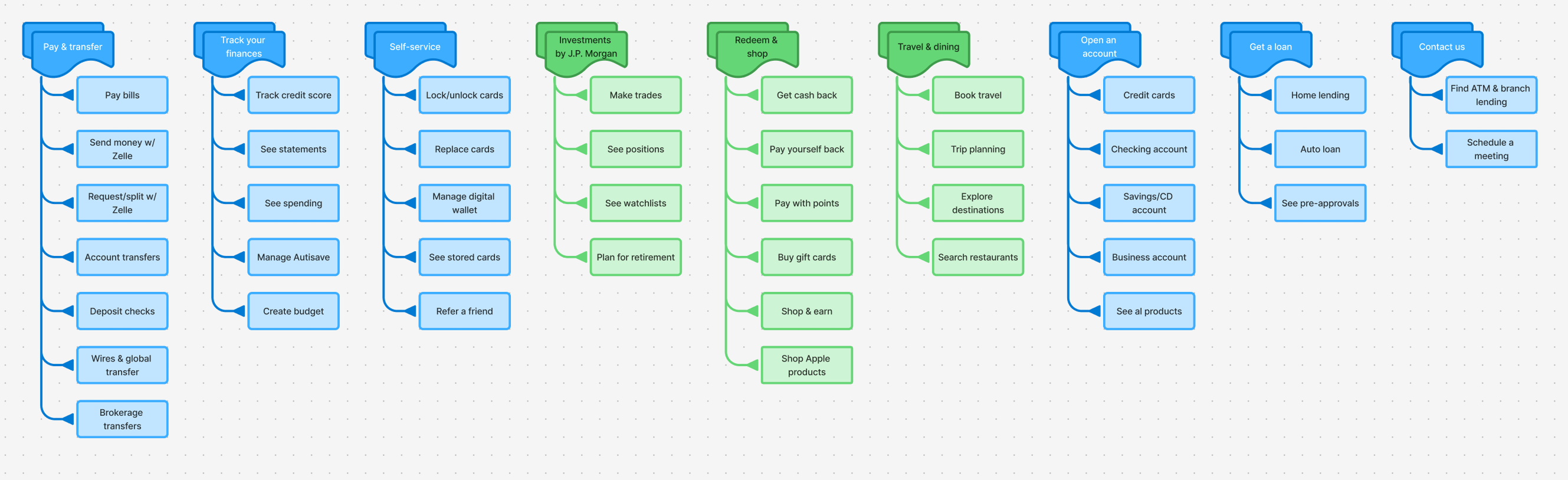
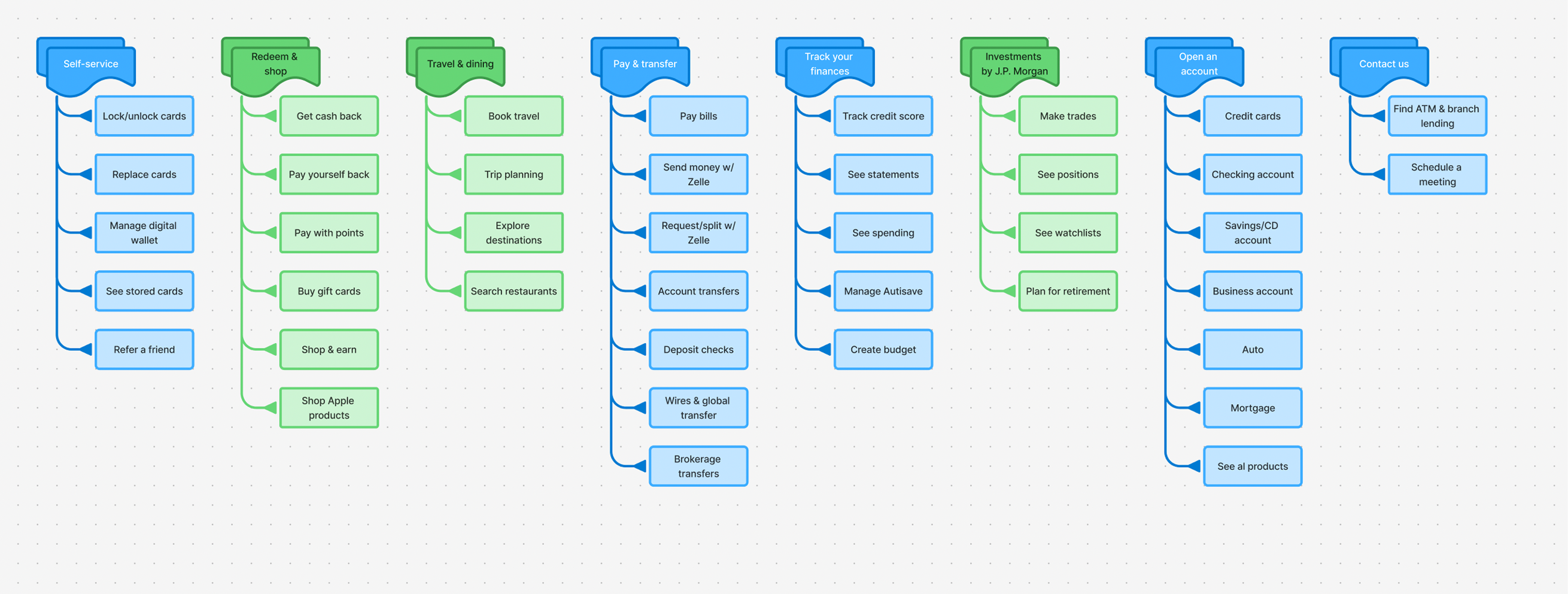
JTBD Framework
Defined IA from scratch using Jobs-to-be-Done framework. Grouped features into Core JTBDs (Pay & transfer, Self-service) vs. Engagement JTBDs (Rewards & shopping, Travel & dining).
Clear Labeling
Crafted short, action-oriented labels that worked across devices and didn't bury users in jargon.
Key Learning
Users will explore beyond the basics. Engagement categories like Travel & dining and Self-service outperformed expectations, proving customers were open to discovery if features were surfaced clearly.
Iteration 2: Data-Driven Refinements
The first launch solved findability, but research showed that findability alone wasn't enough. We turned the menu into a living system, guided by evidence.
A/B Experimentation
Partnered with product and analytics to run A/B tests measuring CTR and engagement patterns.
- Self-service, Rewards & shopping, and Travel & dining showed stronger-than-expected engagement
- "Track your finances" underperformed despite initial prominence
- Data revealed usage didn't match assumptions, guiding better prioritization
Reorganized Categories
Reorganized based on real usage patterns to create precision tuning.
- Elevated high-engagement categories like Self-service, Rewards & shopping, and Travel & dining to more prominent placement
- Reworked underperformers like "Track your finances" to avoid wasting space
- Created a framework that could flex as Chase added new services
Balance & Discovery
Achieved higher CTR in engagement categories without distracting from core tasks. A clearer balance between must-do tasks and discovery features.
Key Insight
IA is a living system. Reordering and restructuring based on behavior kept the menu relevant and turned a navigation experiment into a scalable system.
Iteration 3: Reducing Cognitive Overload
The menu was still dense, and scanning required more effort than it should. Every word matters — shorter, clearer labels cut through complexity.
|
|
|
|---|---|
| Manage digital wallets | Digital wallet |
| See stored cards | Stored cards |
| See statement | Statements |
| See Chase Offers | Chase Offers |
| Get cash back | Cash back |
| Buy gift cards | Gift cards |
| Trip planning | Trips |
| Explore destinations | Destinations |
Evolution Through Three Iterations
What started as a blank slate became a scalable, adaptable system that balanced clarity, discoverability, and simplicity. Each iteration built on learnings from real user behavior and A/B testing data.
Information Architecture Process
A data-driven methodology that transforms user behavior insights into optimized navigation experiences.
User Research & Analysis
Analyze user behavior patterns, click-through rates, and navigation preferences to identify optimization opportunities.
Jobs-to-be-Done Mapping
Categorize user tasks into Primary Core (Pay & Transfer) and Engagement (Rewards & Shopping) JTBDs for strategic placement.
Iterative Design & Testing
Create multiple IA variations and validate through A/B testing to optimize menu structure and user engagement.
Performance Optimization
Monitor engagement metrics and refine the information architecture based on real user data and business outcomes.
Final Reflections
Designing Chase's first "More" menu was more than shipping a navigation hub — it was a staged journey of building, listening, and refining.
First Iteration
Created a central hub where none existed, giving customers a clear place to find secondary features and setting up a foundation for measurement.
Second Iteration
Research and A/B tests revealed unexpected behaviors. By elevating high-engagement categories and reshaping underperformers, we proved the IA could flex with real-world use.
Third Iteration
External benchmarks pushed us further, leading to shorter, clearer labels and the removal of redundant categories. These refinements reduced cognitive load and polished the system for effortless use.
Biggest Lesson
A menu is never "done." Navigation isn't a static feature — it's a living framework that must evolve with users, business goals, and context.
J.D Power says...
"The introduction of a 'More Menu' enhances the findability of information and tools."