Project Overview
I led the content design for Chase's Customer Support Redesign in the mobile app, transforming the Contact Us experience from a call-heavy touchpoint into a self-service digital flow. The goal: empower customers to resolve issues independently, reduce call volume, and create a smoother, more intuitive support journey.
Organization
J.P. Morgan Chase & Co.
Role
Senior Content Designer
Duration
6 months
Year
2024 / 25
Problem
Before the redesign, users were calling the support center within 4 hours of visiting the Contact Us page. Feedback revealed friction with key tasks—like card replacement and claim filing—that weren't easily handled in-app.
Challenge
Redefine the information architecture to match user intents, introduce self-service options for top call drivers, and reduce dependency on live agents while improving confidence and clarity.
Teams
Content · Design · Product
Approach
1️⃣ Data-Led Discovery: Analyzed call logs and user feedback to identify high-volume reasons for contact.
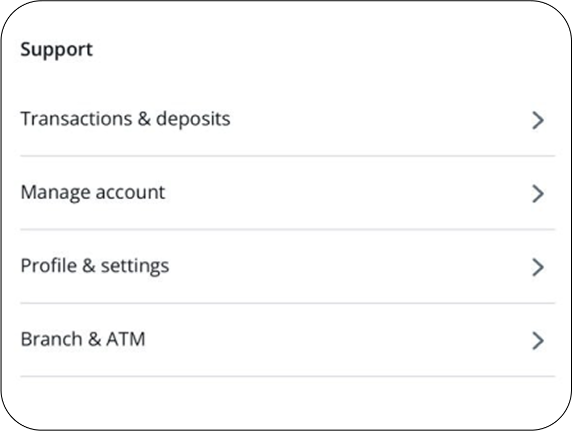
2️⃣ IA Redesign: Built a tiered support structure (L1: Top-level categories, L2: Self-service actions, L3: Contextual help).
3️⃣ Content Design: Used action-oriented labels and concise microcopy to drive immediacy and build trust.
What We Changed
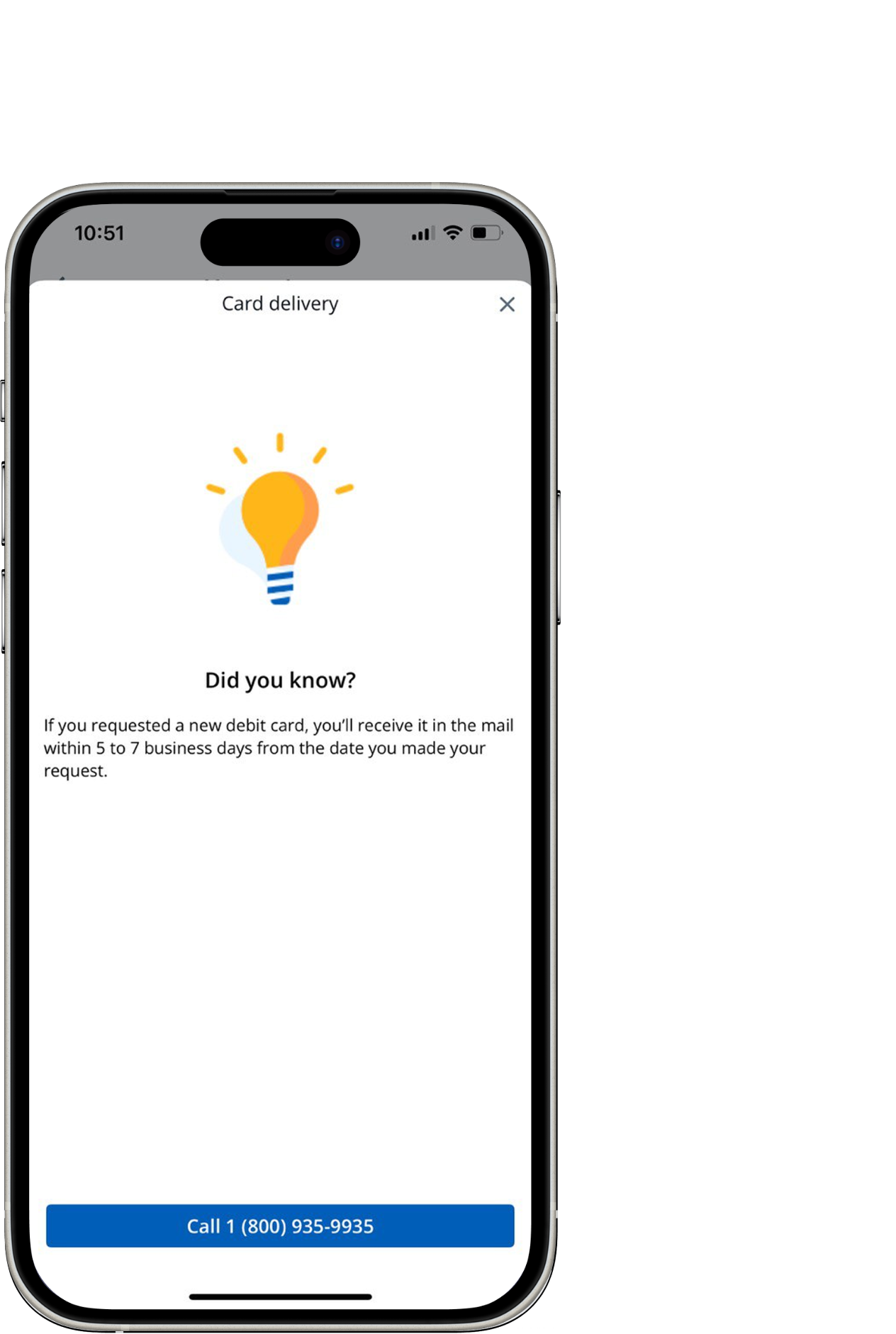
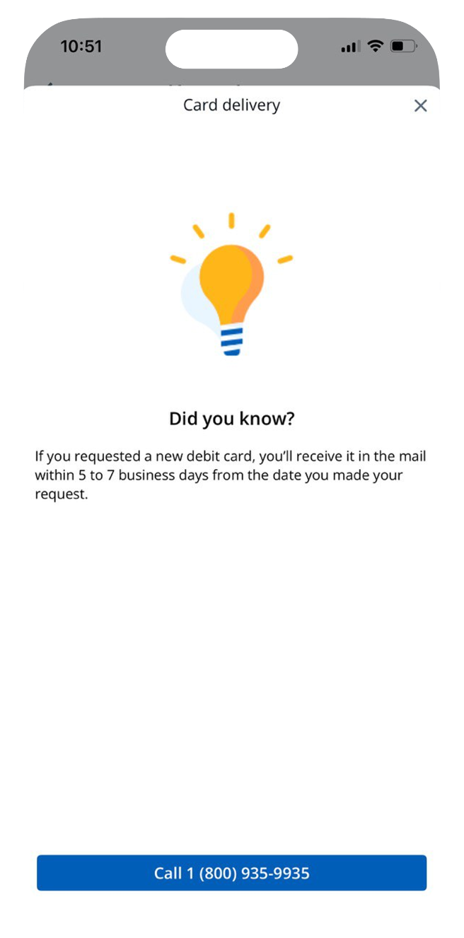
Added self-service modules for high-demand tasks, embedded "Did you know?" tips from call-center recordings, streamlined call pathways with clear escalation points, and optimized IA flow from intent → action → resolution.

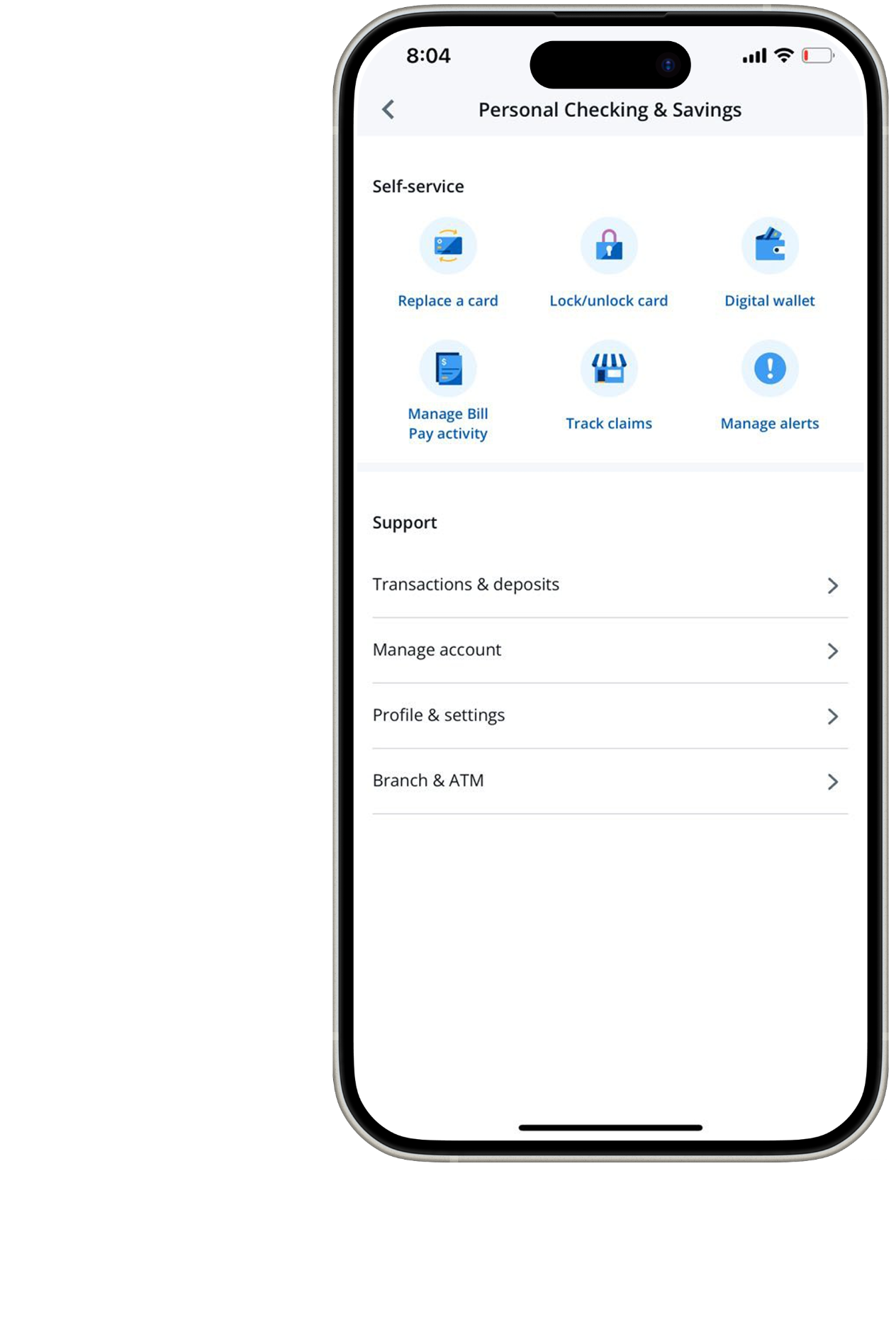
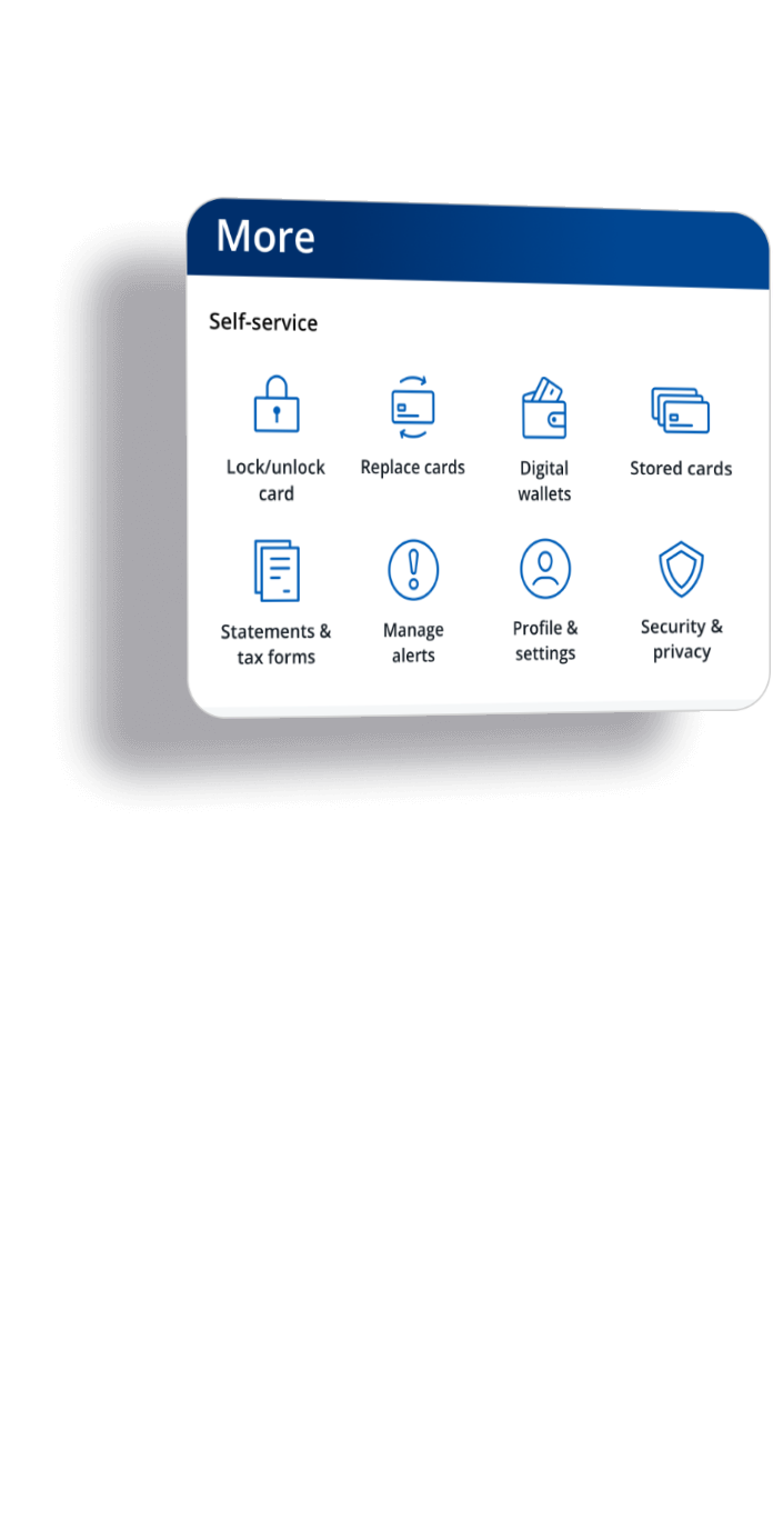
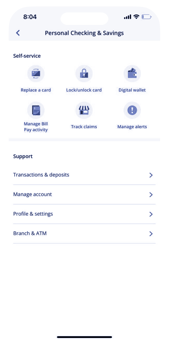
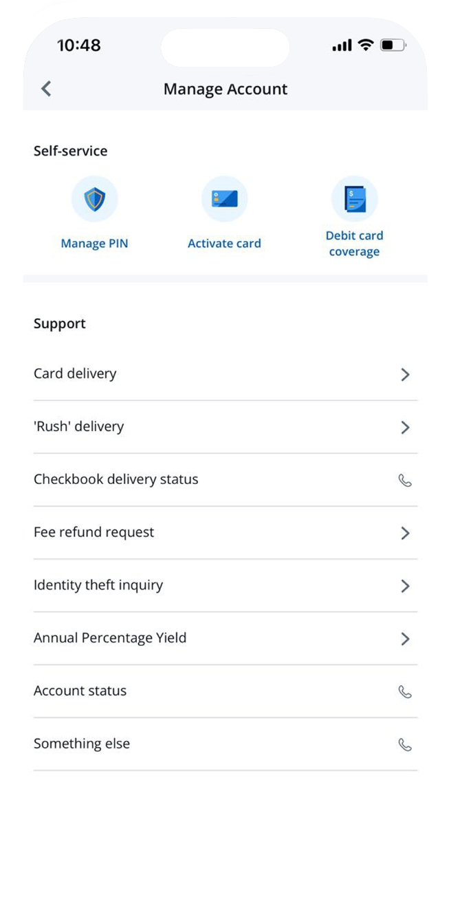
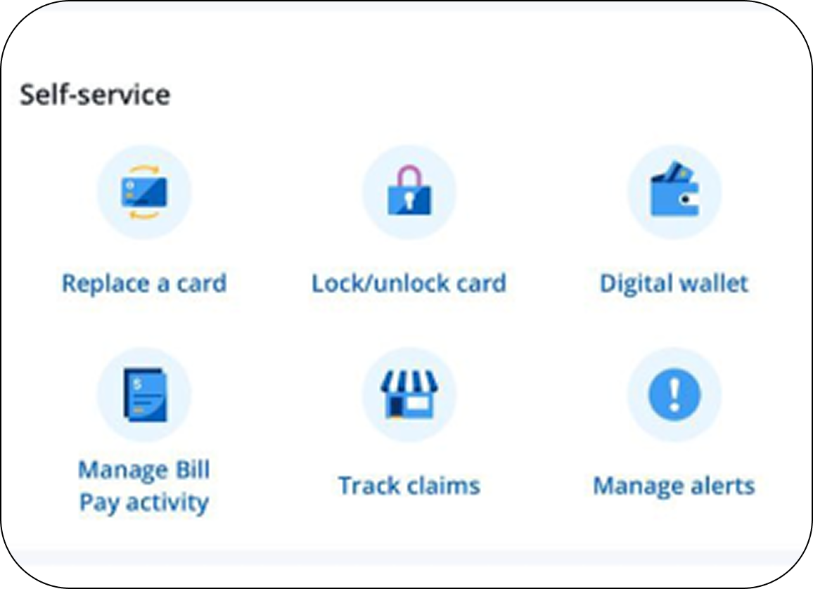
Self-Service Modules
Added dedicated modules for high-demand tasks like card replacement, claim filing, and account management—enabling instant digital resolution.

Proactive Content
Embedded "Did you know?" tips drawn directly from call-center recordings to anticipate questions before they escalate to calls.

Streamlined Escalation
Clear call pathways with visible escalation points ensure customers reach the right department when self-service isn't enough.
Our Approach
Data-Led Discovery
Analyzed call logs and user feedback to identify high-volume reasons for contact. Discovered patterns where proactive content could deflect calls.
IA Redesign & Framework
Built a tiered support structure with Design and Product: L1 (Top-level categories), L2 (Self-service actions), L3 (Contextual help screens addressing frequent questions).
Content & Language Design
Used action-oriented labels ("Replace a card," "Track claims") to drive immediacy. Wrote concise microcopy that anticipates intent and builds trust.
Action-Oriented Labels
Used action-oriented labels like "Replace a card" and "Track claims" to drive immediacy. Action verbs shorten cognitive load and speed task completion, eliminating user guesswork.
Tiered Support Structure
L1 → L2 → L3 Framework
L1: Top-level categories (Checking / Savings / Credit Cards)
L2: Surface self-service actions
L3: Add contextual help screens addressing frequent questions
This tiered approach creates predictable paths from intent to resolution, reducing anxiety and building trust.
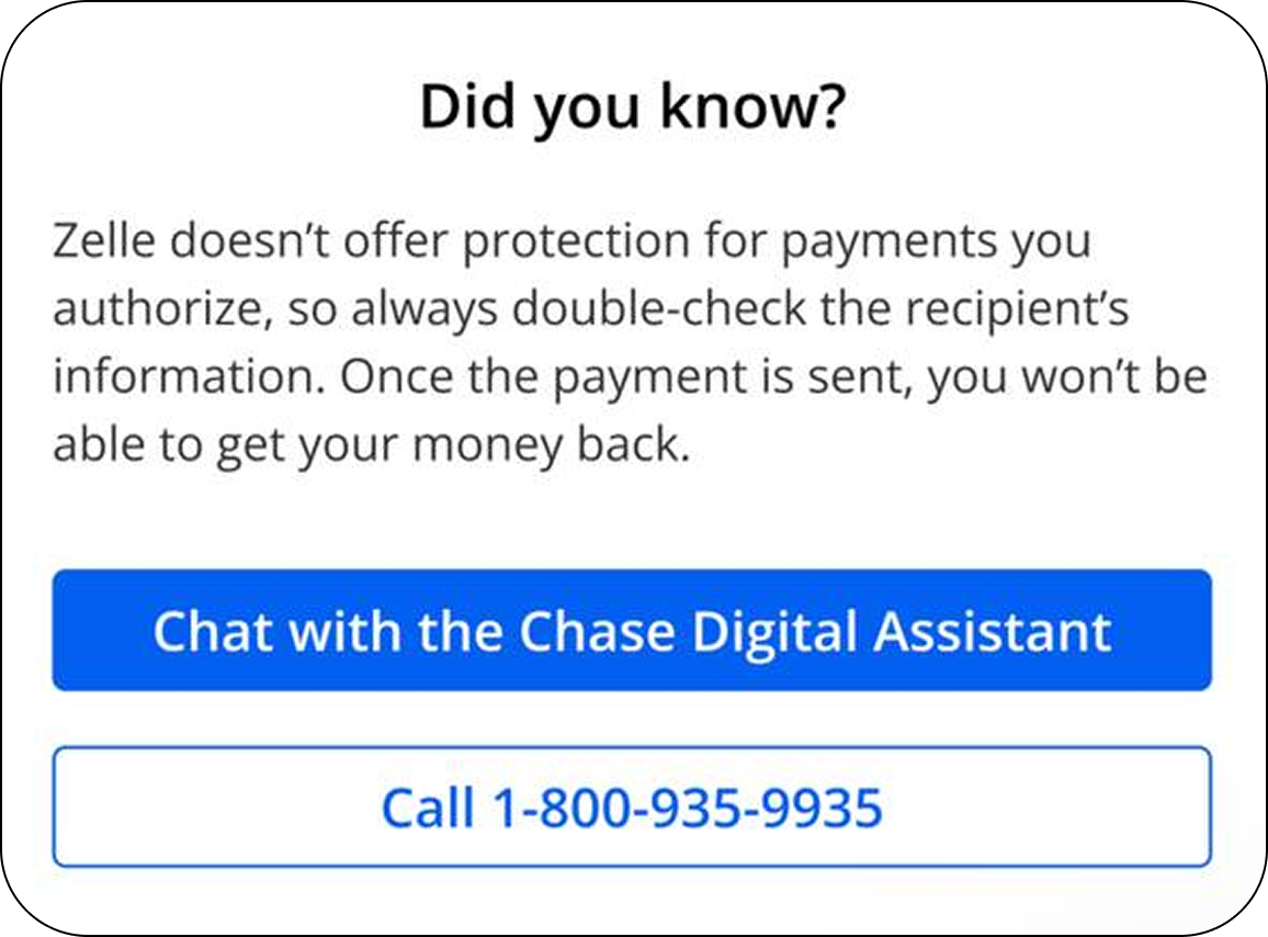
Proactive Content Strategy
Embedded "Did you know?" tips drawn from call-center recordings to anticipate questions before they escalate. Proactive content reduces anxiety and builds confidence in digital support.
Key Learning: When paths are predictable, users feel supported. Anticipate questions before they become calls.
Outcome
This project proved how content and IA alignment can directly influence both user satisfaction and business efficiency. By redefining "Contact Us" as a self-service ecosystem, we turned support from a frustration point into a confident, friction-free experience. User feedback confirmed greater clarity and confidence in digital support, with a sharp decline in negative feedback.
33%
Call Reduction
$2M
Annual Savings
85K
Fewer Calls per Month
What We Learned
- IA clarity = trust. When paths are predictable, users feel supported.
- Proactive content reduces anxiety. Anticipate questions before they escalate.
- Action verbs work. They shorten cognitive load and speed task completion.